Design Custom Nodes with the Visual Node Builder
Use the Visual Node Builder to configure the interface of a reusable action node. This page is a practical guide to the builder and, in particular, the configuration inspector on the right. For the design model behind variants, lines, fields, and element packs, read Logic Node Overview. To place and configure a finished node inside a request, read Logic Flow Builder.
Open Node Builder from the main navigation, a custom-node AI plan, an existing template, or a clone. Define the visual contract here before implementing its tags in Code Builder.
Follow this order for a new node:
- Configure Identity & Appearance.
- Create the node's variants and select the variant you want to edit.
- Add configuration lines in the order users should complete them.
- Add Text Label, Input, or Select fields to each line.
- Define the variant's Base Elements: inputs, outputs, logic flows, and error handlers.
- Add custom element packs for elements that should appear only in certain cases.
- Add conditions, then attach one or more behaviors to each condition.
- Create line or element-pack instances only when a behavior needs an alternative configuration.
- Review the live preview and issue list, then continue to Code Builder.
Identity and Appearance
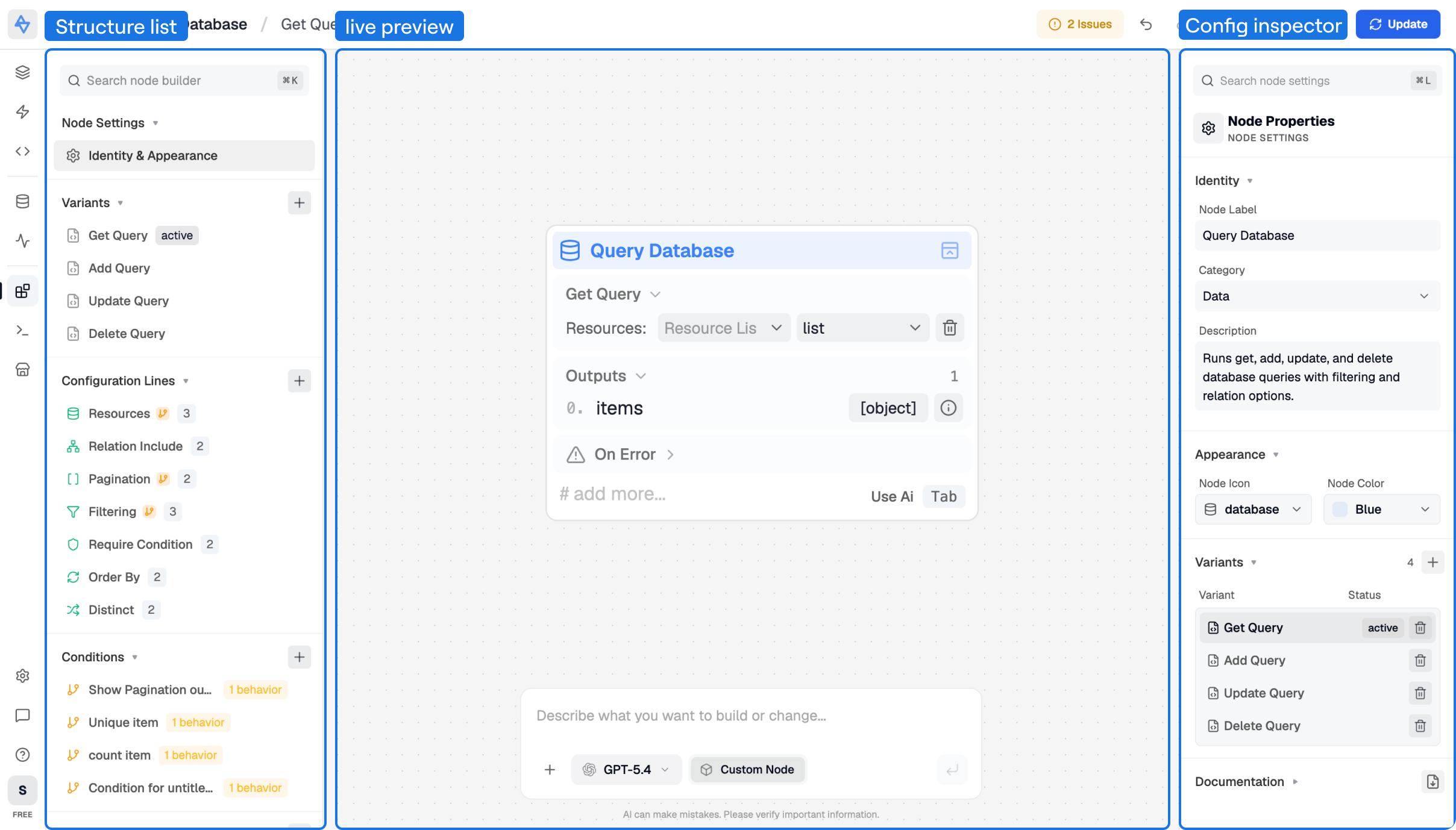
Select Node Settings > Identity & Appearance in the left sidebar. The right sidebar opens Node Properties.
Identity
| Setting | Configuration |
|---|---|
| Node Label | The reusable action name displayed in the library, preview, and canvas. Prefer a short verb and object, such as Validate Coupon or Send Email. |
| Category | Controls the group in which the node appears. Available values are Control Flow, Data, Integration, Security, and Other. |
| Description | Explain what the node does and when to use it. Keep project-specific setup out of this description. |
Appearance
| Setting | Available values |
|---|---|
| Node Icon | Repeat, GitBranch, Database, FunctionSquare, FileText, ArrowUpRight, Zap, Play, Box, Mail, MessageSquare, AlertTriangle, CheckCircle, Clock, Calendar, Lock, Globe, Server, Cloud, Code, Terminal, or Settings. |
| Node Color | Blue, Green, Purple, Yellow, Red, Orange, Teal, Cyan, Indigo, Pink, or Gray. |
The Variants list in this same inspector can add, open, delete, and drag variants into a new order. The Documentation section previews the usage Markdown generated from the current node and can download it as a .md file.
Variants
A variant is one selectable operating mode of the node. Use one variant if the configuration and elements never change at the highest level. Add variants when users must choose between clearly different modes, such as Read, Create, Update, and Delete.
Select a variant from the left sidebar or from Node Properties > Variants. The selected variant becomes active in the preview, and all following lines, conditions, and packs belong to it.
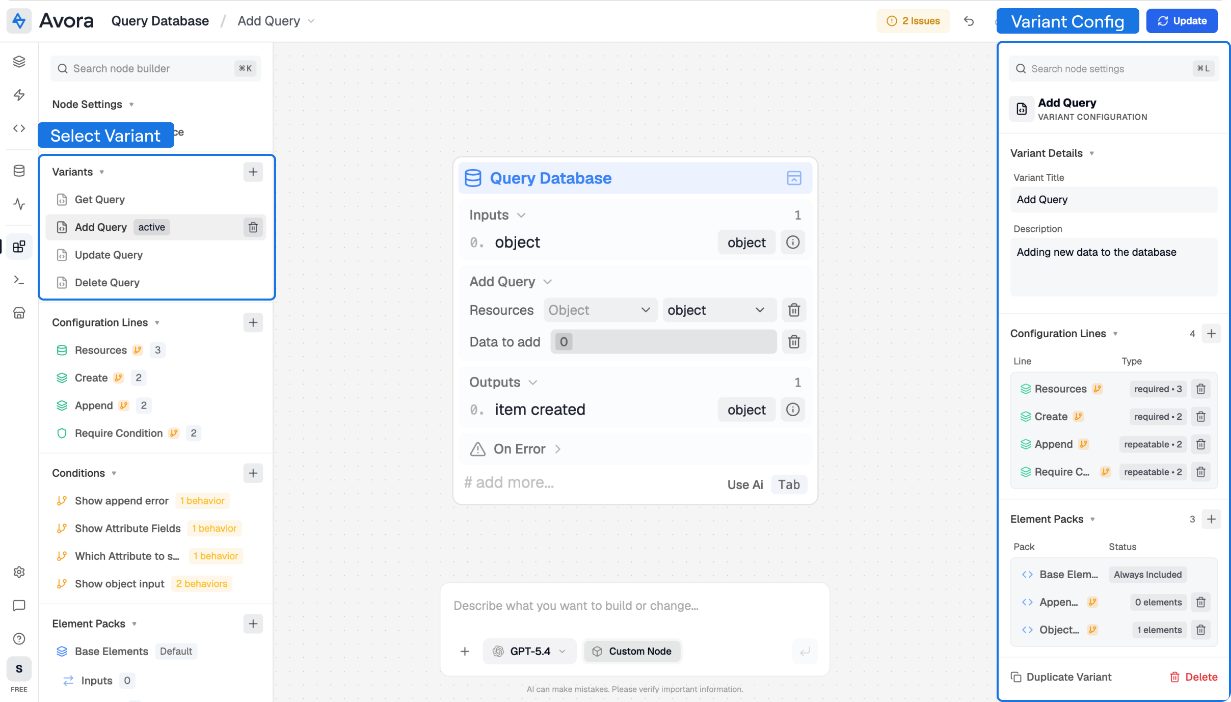
| Right-sidebar control | What to configure |
|---|---|
| Variant Title | The name users select in the node, such as Read Records. Variant titles must be unique. |
| Description | A short explanation of the mode and its result. |
| Configuration Lines | Add a line, open it, delete it, or drag it to change its position in the node. |
| Element Packs | Open Base Elements or add and remove custom packs. |
| Duplicate Variant | Creates a full copy and fresh field IDs. Use it when a new mode shares most of the original structure. |
| Delete | Removes the variant. At least one variant must remain. |
Order variants as users should encounter them. Select the most common variant while reviewing the preview, but inspect every variant before publishing.
Configuration Lines
Lines are the rows displayed inside a node. A line combines a purpose, a visibility rule, and an ordered list of fields.
To add one, select the active variant and choose Add line from either Configuration Lines in the left sidebar or the variant inspector. Select the new line to open Line Configuration.
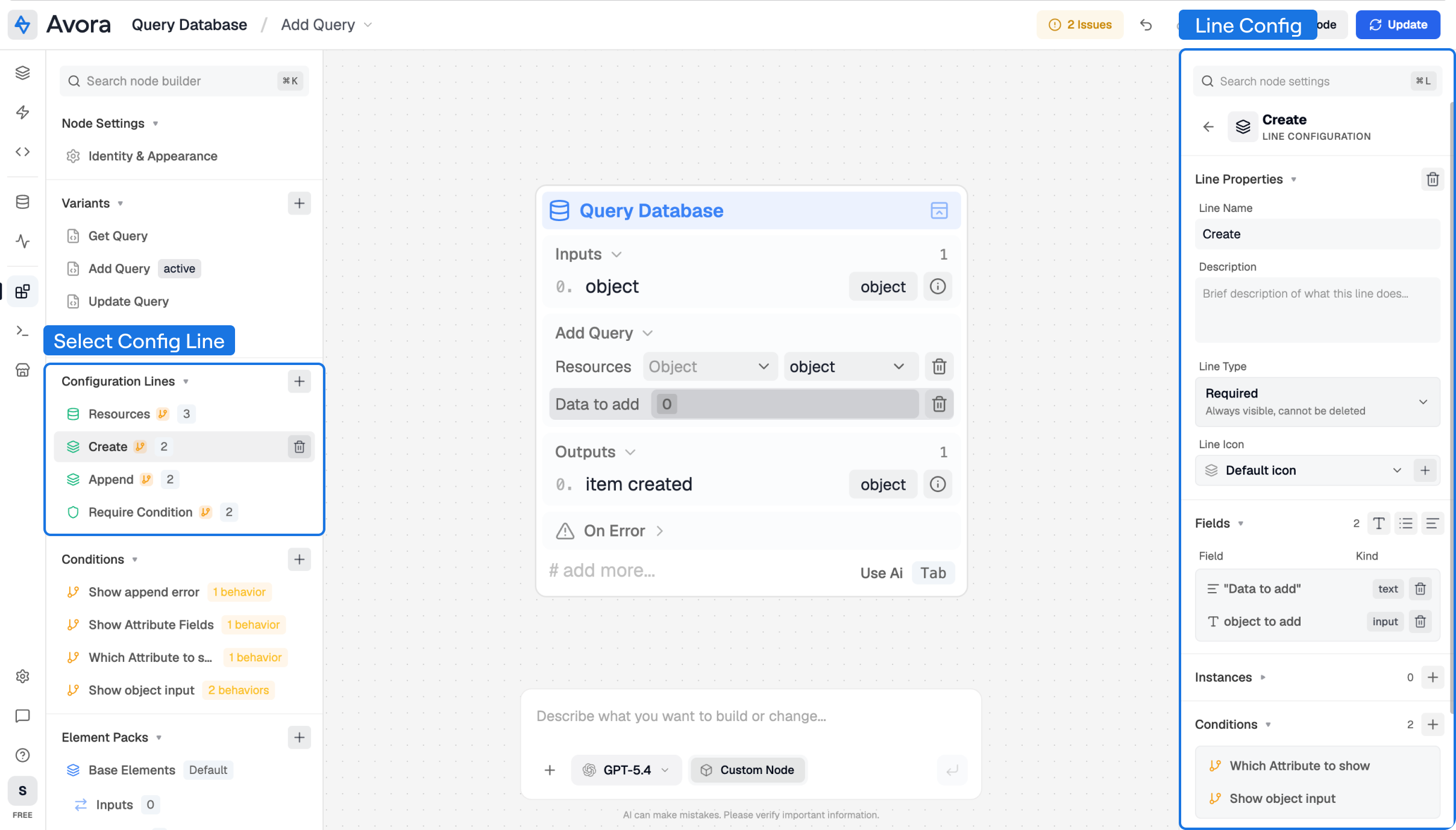
Start with the line properties in the right sidebar. These settings define the line's name, purpose, visibility behavior, and presentation.
| Setting | Configuration |
|---|---|
| Line Name | A readable name for builders, such as Filtering, Authentication, or Pagination. |
| Description | Explains the purpose of the whole row. |
| Line Type | Controls when the line appears and whether the user can repeat it. See the table below. |
| Line Icon | Uses the available Lucide icon library. Choose Default icon to use the standard line icon. |
| Max Instances | Available only for Repeatable lines. Leave empty for no configured limit or enter a number greater than zero. |
| Line type | Behavior in a Logic Flow node | Best use |
|---|---|---|
| Required | Always visible and cannot be removed by the user. | Essential setup without which the action cannot run. |
| Optional | Visible when the variant loads, but the user can remove it and restore it from suggestions. | Useful configuration that should be present initially but is not mandatory. |
| Repeatable | Can be added multiple times from the suggestion menu. | Filters, mappings, headers, rules, assignments, or other repeated rows. |
| Generic Object | Generates configuration rows from a workspace class and its attributes. | Entity payloads and attribute-driven forms. |
Drag fields in the Fields list to control their left-to-right order. Drag lines in the variant inspector to control their top-to-bottom order.
When Line Type is Generic Object, additional settings appear for inherited attributes and relationships.
| Setting | Available values | Effect |
|---|---|---|
| Include Inherited Attributes | On or Off | Includes attributes inherited from parent classes when enabled. |
| Included Relation Types | Association, Composition, Aggregation, Inheritance | Limits which relationships contribute related data. Association and Composition are selected by default. |
| Relation Attribute Style | ID Attribute or Fields | Uses a related object's identifier, or expands the related object into fields. |
Generic Object is the only line type that can be tracked as Attribute in a condition. Attribute conditions evaluate once for each generated attribute.
Fields
Select a line and use the three add buttons in Fields. A line supports exactly these field kinds:
| Field kind | Purpose |
|---|---|
| Text Label | Static text that makes the row readable, such as WHERE, to, or =. It does not collect a value. |
| Input | A typed control in which the user enters or receives a value. |
| Select | A single- or multi-value choice populated from static options or workspace context. |
Field IDs are generated and kept stable when labels change because conditions, default-value references, and Code Builder tags depend on them. The issue button reports duplicate field IDs across the node.
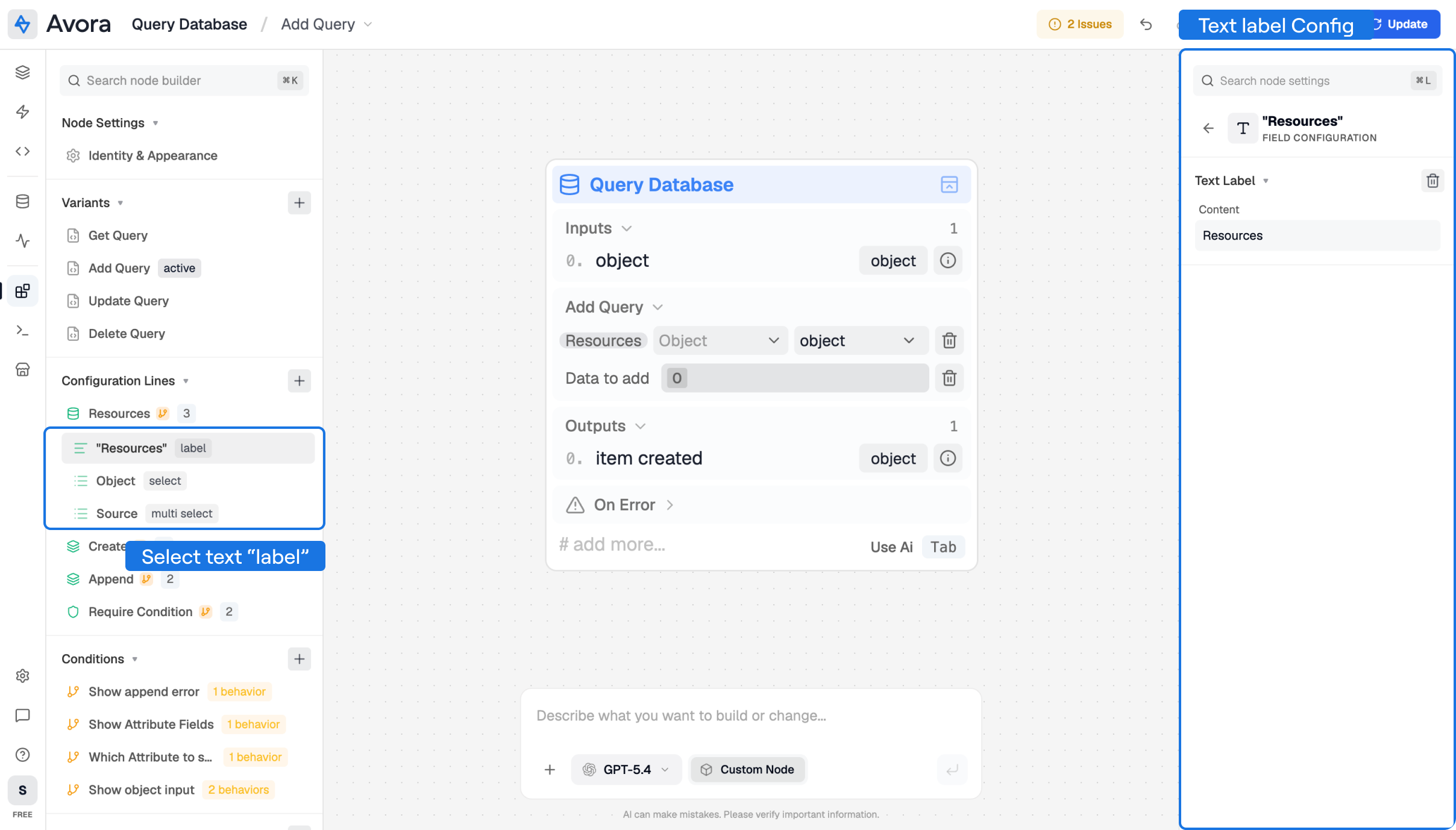
Text Label
Select the label field and enter its Content. Use short connector text; the line name and description already provide the longer explanation.
Input Field
Select an input to configure its label, widget, placeholder, accepted type, and default value.
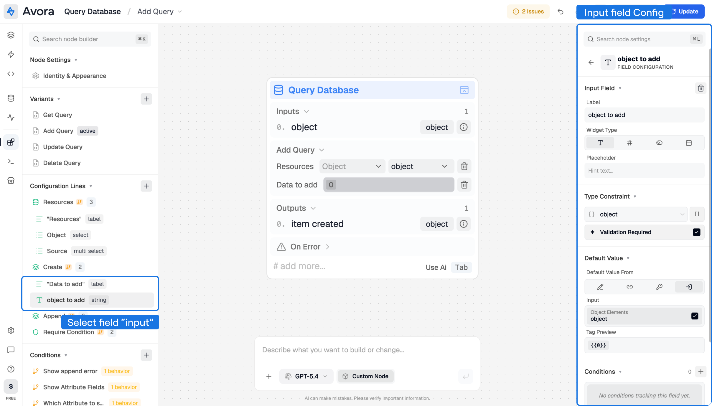
| Widget type | Control shown to the user | Typical value |
|---|---|---|
| Text Input | Text box | Name, expression, path, template, or free text. |
| Number Spinner | Numeric input | Limit, timeout, amount, or count. |
| Toggle Switch | True or false control | Enable retry, strict mode, or include metadata. |
| Date Picker | Date or date-time input | Start date, expiration, or schedule time. |
The Type Constraint validates values connected or referenced by the field. The selector includes String, Number, Integer, Float, Boolean, UUID, Date, DateTime, Text, JSON, File, Any, Object (Parent), Object (Child), Dynamic, Same as field, workspace classes, and workspace enums. Use the array toggle when the field expects a list of the selected type.
| Constraint control | Effect |
|---|---|
| Same as field | Resolves the expected type from another Input or Select field in the same line. Choose that field under Related Field. |
| Validation Required | Treats an incompatible value as an error. Leave it off when the mismatch should not block configuration. |
Choosing a concrete constraint also adjusts the widget to the closest suitable input type. For example, Number selects the number widget and Boolean selects the toggle.
Select Field
Select fields can contain a fixed list or derive their options from the active workspace.
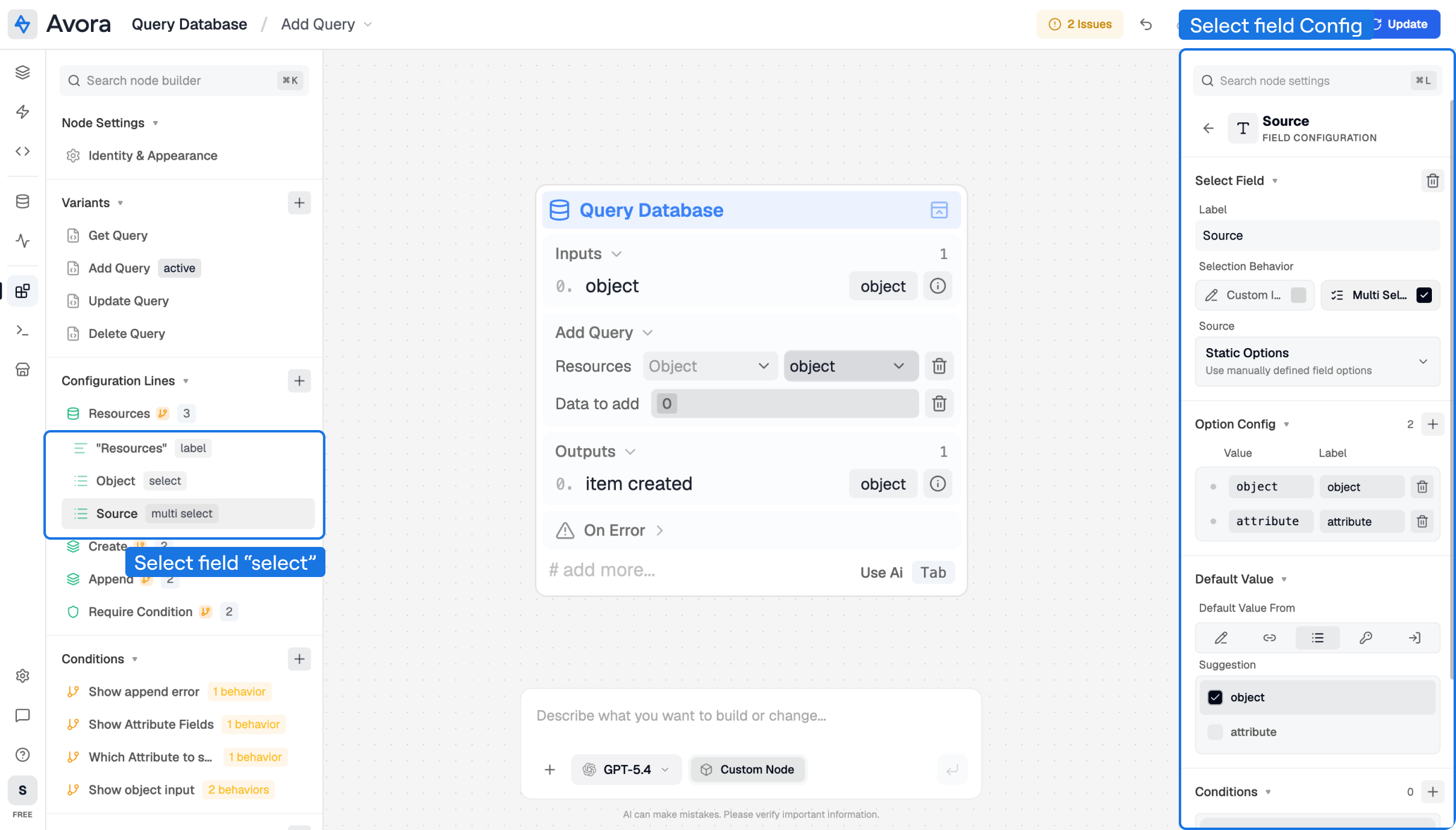
| Selection behavior | Effect |
|---|---|
| Custom Input | Allows a user to enter a value that is not in the presented option list. It is also required when a single Select should accept an environment or input tag as its default. |
| Multi Select | Allows more than one selected value. |
| Source | Options provided to the user | Additional configuration |
|---|---|---|
| Static Options | The Value and Label pairs you add manually. Value is stored and passed to code; Label is displayed to the user. Options can be reordered. | Add, edit, reorder, or delete options. |
| Condition Options | Operators appropriate for another field or a manually selected type. | Point to a sibling field, or leave it empty and set Base Type. |
| Workspace Objects | Classes from the workspace diagram. | Optionally use Related To Field, relation types, and multiplicities to filter the classes. |
| Object Attributes | Attributes of the object chosen by another Workspace Objects Select. | Choose Object Selection Field, then apply relation-type and multiplicity filters if needed. |
Available relationship filters for Workspace Objects and Object Attributes are Association, Composition, Aggregation, Realization, and Dependency. Multiplicity filtering appears when Association, Composition, or Aggregation is selected and supports 1:1, 1:*, M:N, and :. Leaving every relation type or multiplicity enabled stores no extra restriction.
For dependent selects, place the Workspace Objects field before the Object Attributes field, then point the attribute field to it. This gives the preview and Logic Flow node enough context to populate the attribute list.
Default Values for Fields
Input and Select fields share the Default Value From editor.
| Mode | Result |
|---|---|
| Custom | Stores a literal. Boolean inputs show True and False; multi-select fields accept comma-separated values. |
| From Field | Uses the value produced by another compatible Input or Select field in this variant. Incompatible references are filtered or warned about. |
| Suggestions | Uses one or more values from a Select field's static or generated condition options. This mode appears only when suggestions are available. |
| From Env | Stores an environment tag using a workspace environment key. Do not put secrets in a Custom value. |
| From Input | Stores one or more numbered input tags from the variant's element packs. Only compatible inputs are listed, and the inspector previews the resulting tags. |
A Select accepts environment and input tags only when it is single-select and Custom Input is enabled. Otherwise choose a listed option or another compatible field.
Element Packs
An element pack groups the canvas-facing parts of a variant: inputs, outputs, logic flows, and error handlers. Every variant has Base Elements, which are applied automatically. A custom pack is a prepared group that a condition behavior can show, hide, append, or replace with an instance.
Select Element Packs > Base Elements or add a custom pack with the plus button. All pack configuration appears in one right-sidebar panel; selecting Inputs, Outputs, Logic Flows, or Error Handlers in the left tree scrolls directly to that section.
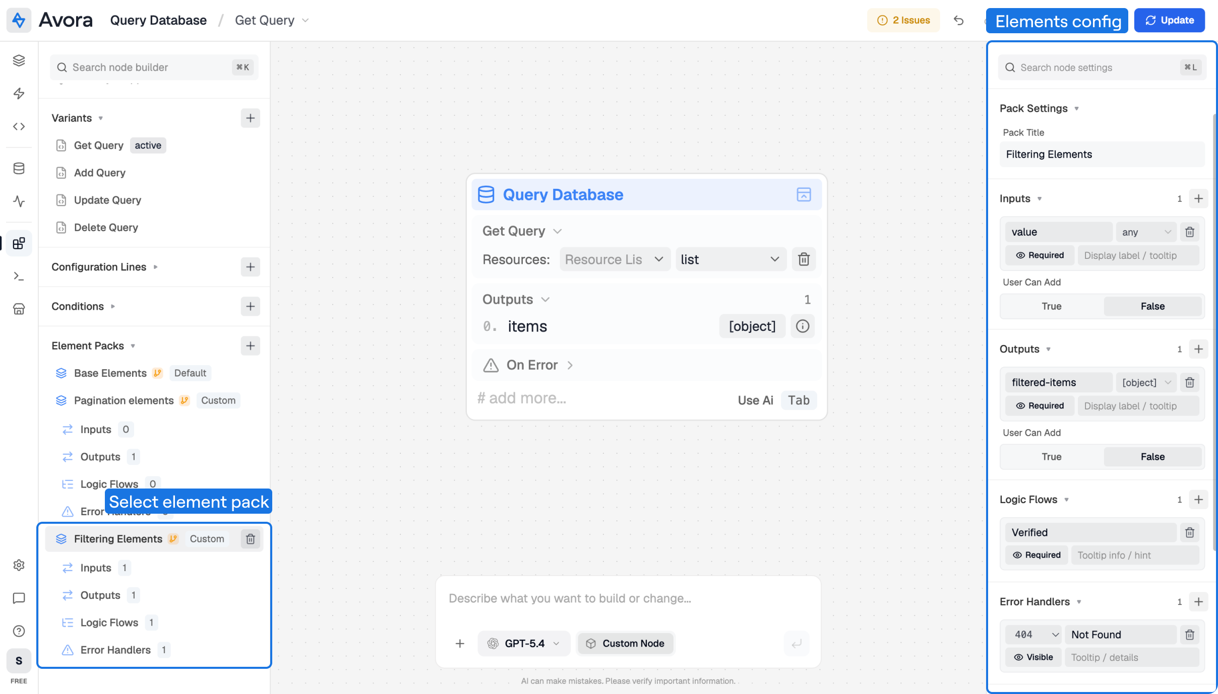
Pack Settings
| Pack setting | Configuration |
|---|---|
| Pack Title | A descriptive name such as Base Elements, Authenticated Result, or Paginated Result. |
| Base Elements | Always attached to the variant unless a condition explicitly changes its visibility or selects one of its instances. It cannot be deleted. |
| Custom pack | Starts empty, can be deleted, and is useful for condition-dependent elements. |
| Instances | Editable copies of the selected pack that can be selected by an Override via Instance behavior. |
Inputs
Inputs are values received from a request or an earlier action in Logic Flow. Select Inputs, choose Add inputs, then configure each row.
| Input control | Configuration |
|---|---|
| Name | The stable key shown on the node and referenced by input tags. Use a code-friendly name such as payload or record_id. |
| Type | Choose String, Number, Integer, Float, Boolean, UUID, Date, DateTime, Text, JSON, File, Any, Object (Parent), Object (Child), Dynamic, a workspace class, or a workspace enum. |
| Dynamic Source | Appears for Dynamic type. Point it to a single-select Object Attributes field; the input type then follows the selected attribute. |
| Required | Visible by default and expected by the node. |
| Optional | Hidden initially and available from the node's suggestion menu. |
| Display label / tooltip | Adds user-facing context without changing the input key. |
| User Can Add | When True, users may add their own inputs to this section. When False, only the defined inputs are available. |
Use the narrowest correct type. Every input referenced by a field's From Input default must be connected when the finished node is used.
Outputs
Outputs are values produced for later actions or request outputs. They use the same controls and type list as inputs.
Choose a meaningful, stable output name and the type downstream nodes should receive. Use Dynamic with an Object Attributes pointer when the output type follows a selected attribute. Set an output to Optional when it should be available through suggestions instead of appearing on every node instance. Enable User Can Add only when arbitrary additional outputs are valid for the implementation.
Changing a published output name or type can invalidate existing connections. Treat it as a contract change and update the Code Builder implementation before republishing.
Logic Flows
A Logic Flow element is a named execution branch exposed by the node. This section defines the branch handle; it does not build the actions inside that branch.
| Setting | Configuration |
|---|---|
| Title | The branch name shown on the node, such as True, False, Loop Body, or Fallback. |
| Required | The branch is visible when the node is created. |
| Optional | The branch is hidden initially and can be added from suggestions. |
| Tooltip info / hint | Explains when the branch runs or what should be placed inside it. |
Error Handlers
Error handlers define expected failure exits. Add one handler for each failure that callers or later logic need to distinguish.
| Setting | Available values and behavior |
|---|---|
| Status | 400 Bad Request, 401 Unauthorized, 403 Forbidden, 404 Not Found, 405 Method Not Allowed, 408 Request Timeout, 409 Conflict, 422 Unprocessable Entity, 429 Too Many Requests, 500 Server Error, 502 Bad Gateway, or 503 Service Unavailable. |
| Message | Defaults to the selected status label and remains editable. Use a specific runtime failure name where possible. |
| Visible | Displays the handler on every node using this configuration. |
| Optional | Hides the handler initially and makes it available through suggestions. |
| Tooltip / details | Explains when the error occurs and helps users route it correctly. |
The builder defines the available error contract. The Code Builder determines when the implementation raises or maps each error.
Conditions and Behaviors
Conditions answer when the interface should change. Behaviors answer what changes. Build the target line, pack, and any required instances first so that they are available in the condition inspector.
Conditions
Add a condition with the plus button beside Conditions in the left sidebar. Select it to open Condition Rule in the right sidebar.
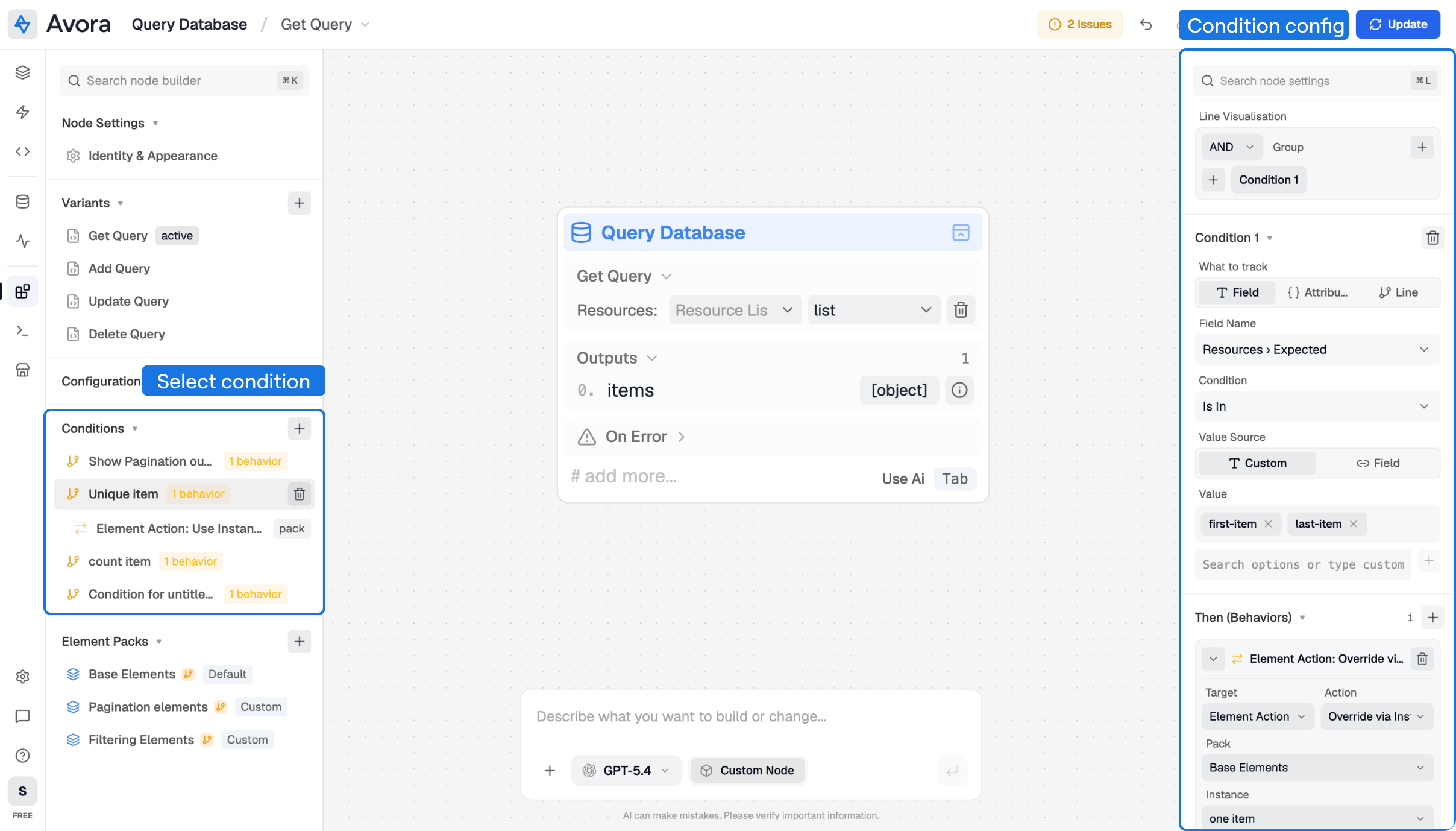
- Enter a unique Condition Name.
- In Line Visualisation, select the condition chip you want to edit.
- Choose What to track and the specific field or line.
- Choose an operator.
- When the operator needs a comparison, choose Custom or Field as the value source.
- Add conditions or nested groups and choose AND or OR for each group.
- Add one or more behaviors under Then (Behaviors).
| What to track | Evaluated value | When to use it |
|---|---|---|
| Field | The current value of an Input or Select field, including a field inside a line instance. | React to an operation, toggle, number, object, attribute, or other configured value. |
| Attribute | The name of each generated attribute in a Generic Object line or instance. | Show, hide, or override selected generated attributes. |
| Line | Whether a base line or line instance is currently appearing. | Chain interface behavior to the presence of another line. |
| Target value type | Available operators |
|---|---|
| Text or general field | Equals, Not Equals, Is In, Contains, Is Empty, Is Not Empty. |
| Number field | All general operators plus Greater Than, Less Than, Greater Than or Equal, and Less Than or Equal. |
| Boolean field | Is, Is Not. |
| Select or multi-select field | Equals (Exact), Is In, Contains, Is Empty, Is Not Empty. |
| Attribute name | Equals, Not Equals, Is In, Contains, Is Empty, Is Not Empty. |
| Line visibility | Appearing, Not Appearing. |
Is Empty, Is Not Empty, Appearing, and Not Appearing need no comparison value. For other operators, Custom compares against a literal or selected option, while Field compares against another existing field. Is In and multi-select comparisons accept more than one custom value.
Use nested groups for expressions such as (provider = Stripe AND retries > 0) OR fallback is appearing. Keep rules small and name them after the result they control.
Behaviors
Each condition can run multiple behaviors. Choose Add behavior, then select the target category, action, and exact line, pack, instance, or override.
| Target | Available actions | Target selector |
|---|---|---|
| Line Action | Show, Hide, Append Instance, Override via Instance. | A base line or eligible line instance. Append is limited to Repeatable lines. |
| Element Action | Show, Hide, Append Instance, Override via Instance. | Base Elements or a custom element pack. |
| Attribute Action | Show, Hide, Custom Override. | The attribute currently evaluated by an Attribute condition. Custom Override selects a line or line instance to use for that attribute. |
| Action | Runtime effect |
|---|---|
| Show | Makes the target visible when the condition is true. If a line or pack has a Show rule, it starts hidden until a matching Show condition succeeds. |
| Hide | Hides the target when the condition is true. A target controlled only by Hide rules starts visible. |
| Append Instance | Makes a Repeatable line available or appends the selected pack's elements. When an element append is driven by a Repeatable line, the appended elements can repeat with that line. |
| Override via Instance | Keeps the target identity but uses the selected prepared line or pack instance while the condition is true. |
| Custom Override | For a generated attribute, uses the selected line or line instance as that attribute's configuration. |
Select Configure Instance to open the chosen instance without losing the path back to the condition. A condition can combine, for example, a Line Action that shows authentication settings and an Element Action that adds authentication outputs.
Instances
An instance starts as a copy of a line or element pack. It is an alternative configuration used by Override via Instance; it is not another item shown automatically.
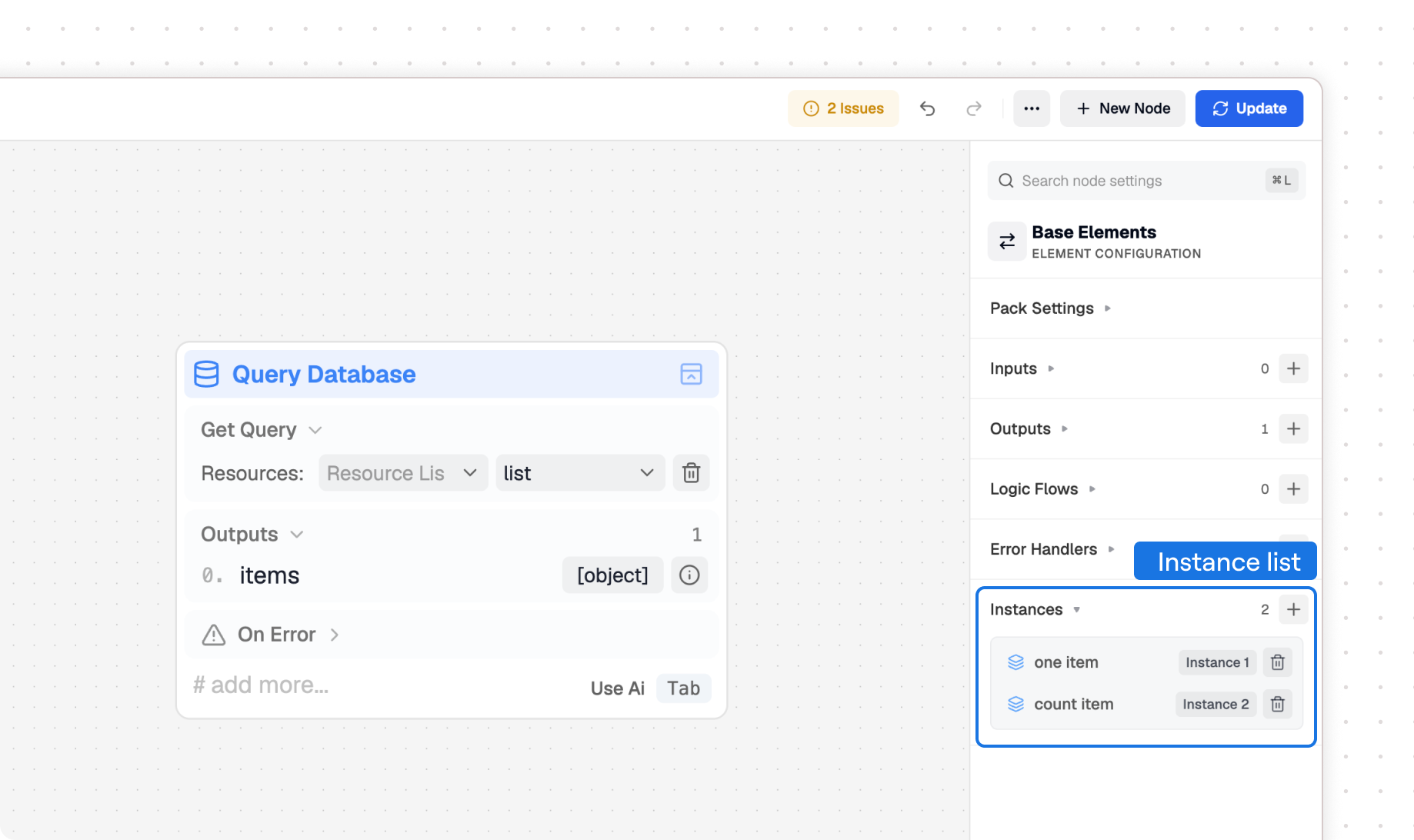
| Instance type | How to create it | What can differ |
|---|---|---|
| Line instance | Open a base line and choose Add instance, or choose Create Instance from a Line Action using Override via Instance. | Name, description, type, icon, fields, generic-object settings, and repeat limit. |
| Element-pack instance | Open Base Elements or a custom pack and choose Add instance, or choose Create Instance from an Element Action using Override via Instance. | Title, inputs, outputs, logic flows, error handlers, and User Can Add settings. |
Instances are copied at creation time. Later changes to the base do not automatically merge into existing instances, so review them after editing the original. Give every instance a name that describes the condition in which it is used, such as Paginated Result or Authenticated Input.
Use a separate custom pack or line when the structure represents an independent reusable part. Use an instance when it is an alternative version of one existing target.
Before opening Code Builder:
- Switch through every variant and review the live preview.
- Test condition values and confirm the expected lines and packs appear.
- Resolve duplicate variant names, duplicate line names in the active variant, and duplicate field IDs reported by the issue list.
- Check that every From Input default has a compatible defined input.
- Confirm that output names, logic-flow titles, and error handlers form the contract you intend to implement.
The More actions menu can copy a test snapshot, import JSON text, import a JSON file, or download the visual configuration as JSON. Importing replaces the current draft configuration, while New Node asks for confirmation before clearing unsaved work. Use Publish for a new template or Update for an already-published template.
Continue to Code Builder to implement the visual contract. When the visual structure and code both pass review, follow Publish, Share, and Clone.